A new metric to assess the insurance cycle?
Research by ICMR shows that comparing stock performance of specialty re/insurance companies with the S&P 500 can provide new insight into the state of the insurance cycle
What’s happening to the underwriting cycle?
Hard and soft markets are funny things; we know when we’re in either of them, but we struggle to find tangible real-time evidence to prove it. We collect premium rate monitoring information, yet that still relies on an underwriter’s judgement, at a snapshot in time, to capture all of the subtleties of evolving terms, conditions, deductibles, exclusions and premium change all in a single number. When we look at historical loss ratio data, we have to try to “normalise” it to remove the awkward lumps and bumps of real life losses, adding further layers of judgement.
Underwriting and economic cycles
Some of the earliest research we undertook at the Corporation of Lloyd’s back in the early 2000s clearly demonstrated that Catastrophe Losses alone don’t drive underwriting cycles (the movement between periods of hardening premium rating, where rate adequacy rises then falls), although they can accelerate pre-existing momentum. Previous underwriting cycles at Lloyd’s are illustrated below and have had similar durations to wider economic cycles, but they have very rarely coincided.
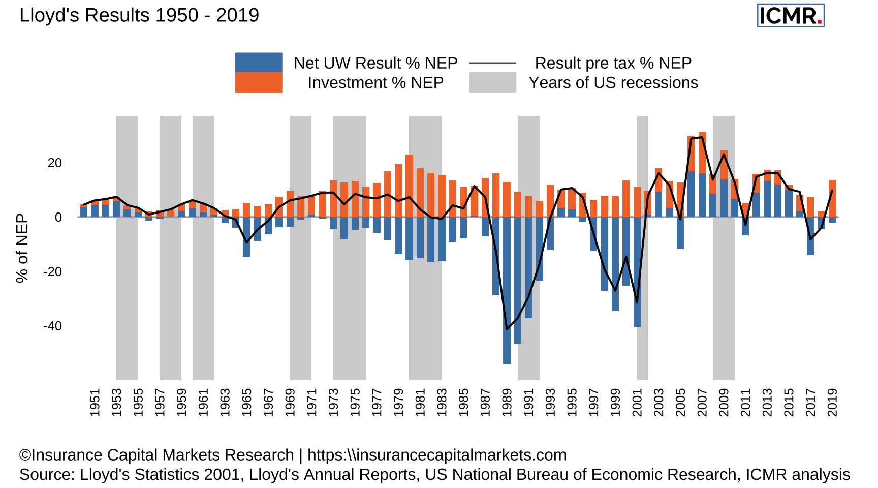
Figure 1: The chart shows Lloyd’s results broken down into underwriting and investment performance since 1950 and years of US recessions highlighted in grey. It clearly demonstrates periods of underwriting profits and losses, the underwriting cycles. Individual cat years had little impact on changing the direction of travel., eg Hurricane Andrew (1992), WTC (2001), KRW (2005)
At ICMR, we believe the underwriting cycle is a bit like dark matter; you can’t observe it directly, but you can observe it indirectly. We believe the interplay between economic and underwriting cycles is the key to demonstrating the point of cycle in real time.
We know that underwriting cycles are very similar to economic cycles in duration but are out of phase with them. This is logical, given the importance of investment return in insurers’ results and their evolving appetite for higher or lower marginal pricing with fluctuating investment returns on float. These cycles are not perfectly out of phase (like a sine curve vs a cosine curve) but are further out of step such that the difference between the two should manifest as a steady rise and a steady fall of the difference between the two over time. That is to say, the relative cycle will start with insurance at a low point (where capital markets outperform it) followed by a period where the reverse is true before returning to the start.
The specialty insurance cycle in terms of relative pricing advantage to the S&P 500
To test this hypothesis we looked at the cumulative returns in the daily differences between the LIMI (our proprietary London Insurance Market Index based on the publicly listed parent companies of Lloyd’s managing agencies); and the S&P 500, the latter representing perception of value in the economy, the former representing perception of value in underwriting.
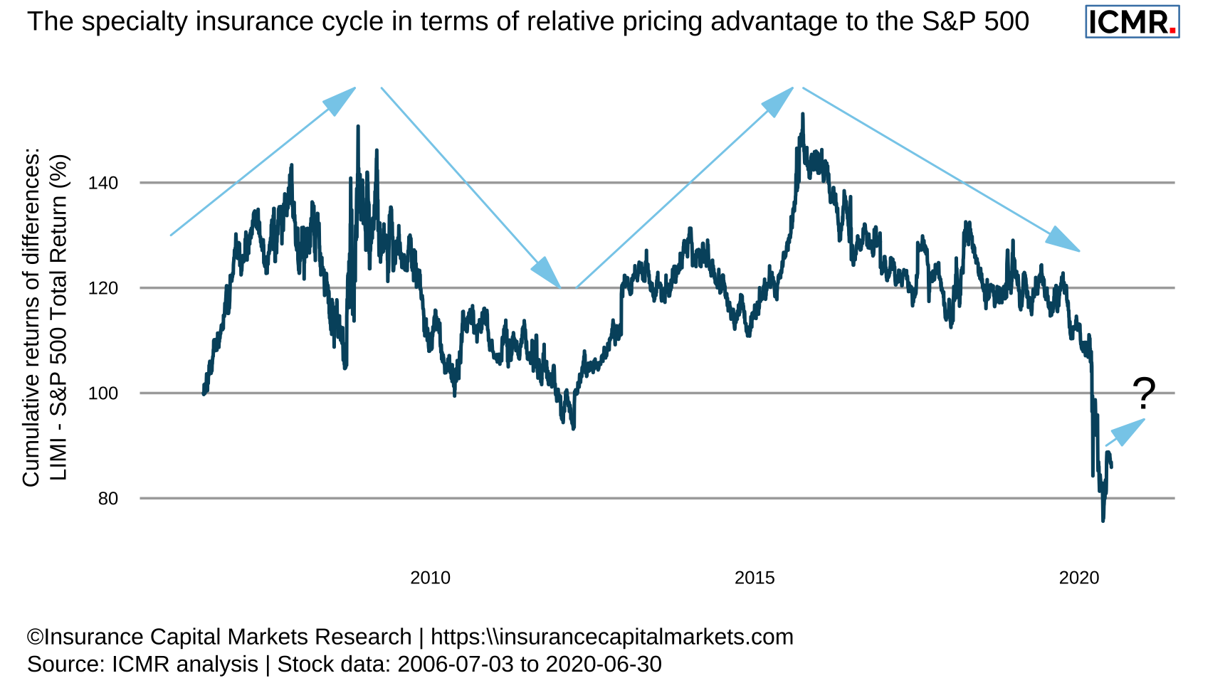
Figure 2: This chart shows the cumulative difference in daily returns between LIMI and S&P 500TR. The underwriting cycle appears as the period from trough-to-trough, notwithstanding the reduction then rapid correction recorded during the financial crisis of 2008. We contend that for LIMI (and therefore for Lloyd’s) the first trough-to-trough cycle started before the chart begins (c.2005) and ended in early 2012. The next trough-to-trough cycle appears to have ended now.
If we look at the cumulative returns of the difference in daily returns between these two indices, we start to see the aforementioned rising and falling pattern emerge.
The first relative trough-to-trough cycle shown ended in early 2012. We can see the initial downturn following the financial crisis - due in part to concerns over insurance companies’ asset portfolios following AIG’s issues - was quickly reversed, and so did not constitute a separate underwriting cycle itself.
The performance over the last quarter suggests a potential crossover point has been reached. Anecdotal evidence from the market of price firming may be the start of a new period where capital markets perceive insurers to be well placed to outperform again, notwithstanding remaining uncertainty on the ultimate cost of COVID-19. This view is further supported by already announced specialty insurer equity capital raising, i.e. permanent capital as supposed to third party capital, so far in 2020.
In addition, we also understand that reload capital is perhaps not as prevalent in the ILS market as in previous years, at least not for collateralised reinsurance. All of which may augur well for sustained premium rating. This difference in daily returns is a metric we shall be watching carefully.